©
2020
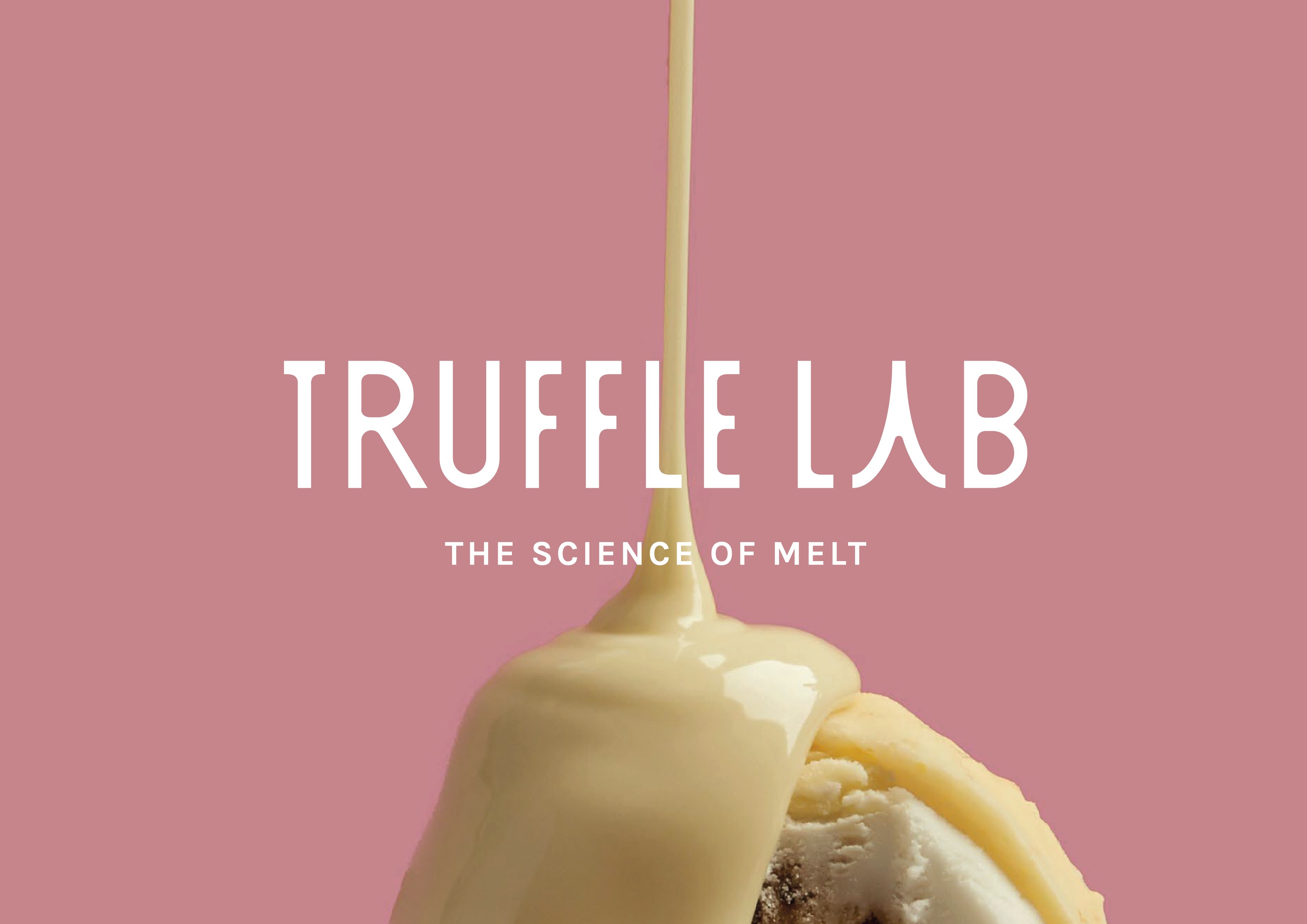
Crafting the art of melt

Truffle Lab needed a brand identity that blended indulgence, precision and contemporary chocolate craftsmanship.
Truffle Lab was created for chocolate lovers who crave a more elevated experience — one where texture, flavor and science come together in perfect harmony. The brand specializes in melt-in-your-mouth truffles designed with care, creativity and a modern sensorial approach. The identity needed to express this balance: bold enough to stand out, yet soft and elegant enough to match the refined nature of their product. We developed a visual language that celebrates smoothness, experimentation and the irresistible pleasure of a perfect melt.
Services
Date
Nov 2020
Client
Orbital
Industry
Orbital
Timeline
NaN Months

THE CHALLENGE
Truffle Lab needed a brand presence that communicated gourmet quality while feeling fresh and playful.
The premium chocolate market is filled with heritage brands that lean heavily on tradition. Truffle Lab, however, represents a new generation of chocolatiers — curious, experimental and committed to creating joyful sensory moments. The challenge was crafting an identity that felt indulgent without being old-fashioned, expressive without being overwhelming and scientific without losing warmth. The brand had to speak directly to a modern audience that values flavor exploration, contemporary aesthetics and memorable experiences.


THE SOLUTION
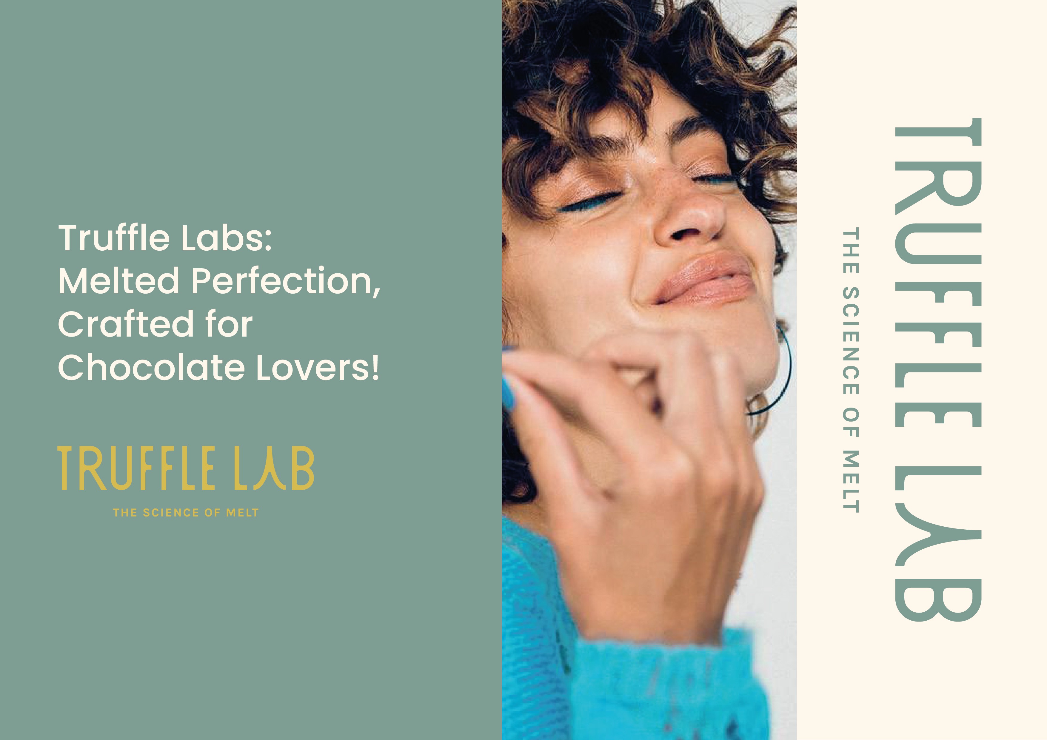
We created a minimal and expressive identity defined by vibrant colors, clean forms and a signature sense of melt.
The new system combines smooth curves, modern typography and a palette that feels deliciously bold. Each visual element echoes the melting textures found in Truffle Lab’s chocolates — soft gradients, flowing shapes and warm tones that highlight the brand’s sensorial nature. The result is a fresh and uplifting identity that balances gourmet refinement with approachable fun, supporting packaging, digital presence and product storytelling with equal impact.

THE PROCESS
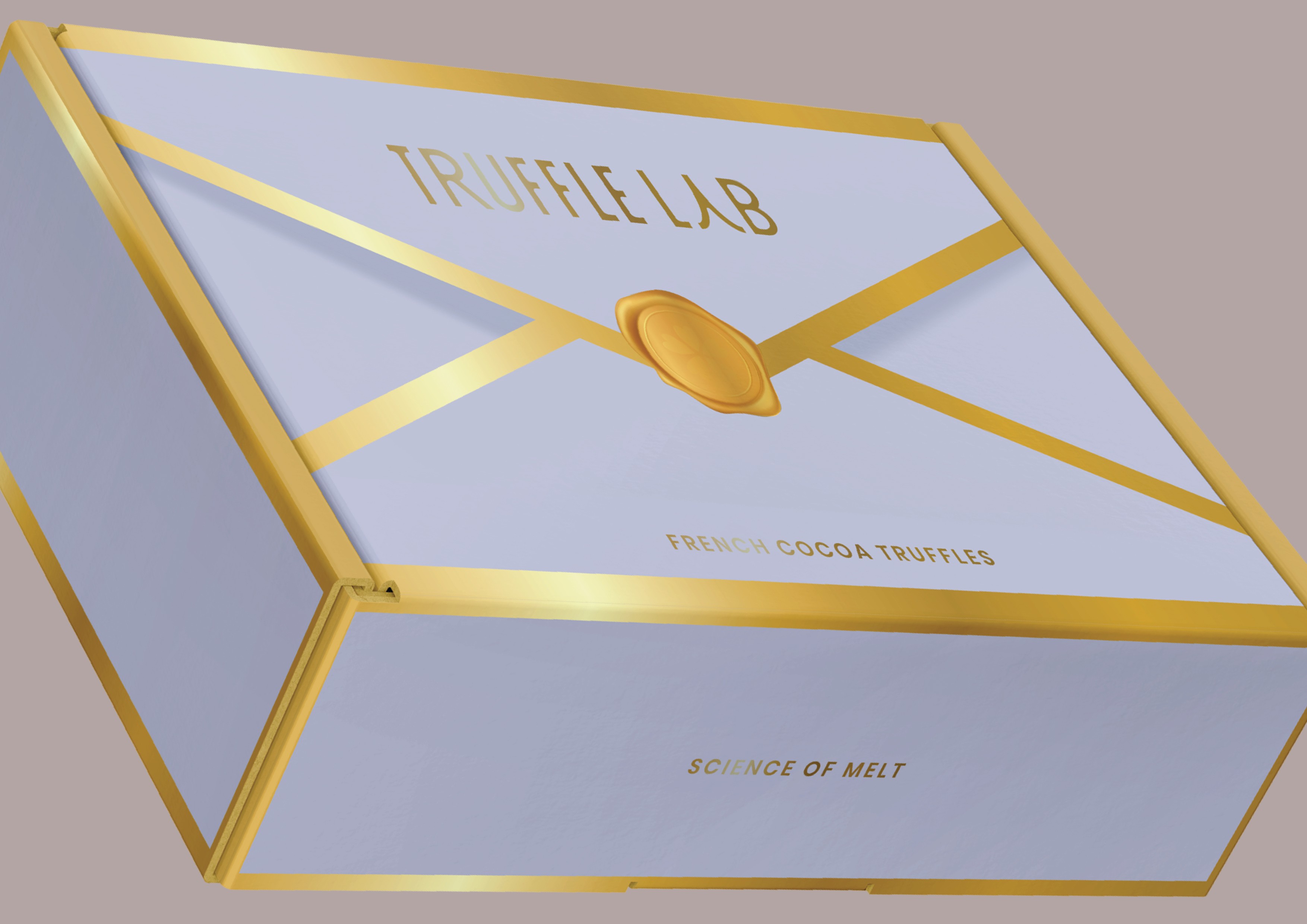
Brand strategy, visual identity, packaging concept, color direction and typography system developed over 8 weeks.
Our process focused on translating the melt experience into a cohesive visual universe. We explored forms inspired by smooth chocolate flow, defined a playful yet premium tone of voice and developed packaging concepts that stand out on shelves through simplicity and color. Every decision was guided by the brand’s essence: taste as a science, and chocolate as an experience meant to be savored.

By the numbers